
Dispatch analytics are the operational telemetry and dashboards that let you assign the right technician faster, cut empty miles, and hold service level agreements without guesswork. The payoff shows up in three places: assignment speed, utilization, and predictability. Start by tracking a small set of KPIs, feeding them from your GPS, telematics, and job records, and putting them on a live dashboard your dispatchers actually watch during the shift, not a report they read the next morning.
TL;DR:
- Tracking only 3 to 5 core KPIs, such as time-to-assign and SLA breach rate, prevents data overload and focuses action on critical issues.
- Embedding dispatch analytics into the operational tools routinely used by dispatchers significantly increases adoption and immediate action.
- Real-time dashboards displaying live queue, ETA, and SLA heatmaps enable swift responses to response time slips and missed thresholds.
- A common implementation pitfall is ignoring data quality and hygiene, which can distort metrics and hamper effective decision-making.
- Future advances in predictive and prescriptive analytics, powered by machine learning, will enable proactive dispatching and better job-to-technician matching.
Table of Contents
- Core Dispatch KPIs and How to Calculate Them
- What a Dispatcher Actually Needs on Screen
- How to Convert Analytics Into Action: Four Practical Playbooks
- How TradePilot's Analytics Map to These KPIs and Playbooks
- Common Challenges and Pitfalls in Dispatch Analytics Implementation
- Benchmarks and Industry Standards for Dispatch Performance Metrics
- Case Studies or Examples Demonstrating Benefits of Dispatch Analytics
- Future Trends and Emerging Technologies in Dispatch Analytics
- A Dispatch Supervisor's Take on Making Analytics Stick
- How TradePilot Helps You Put Dispatch Analytics to Work
- Sources
Core Dispatch KPIs and How to Calculate Them
Most dispatch teams try to track everything and end up acting on nothing. Multiple logistics analytics guides recommend picking 3 to 5 KPIs tied to your current pain point rather than monitoring a dozen metrics nobody reviews.
Here are the metrics that matter most for field service and emergency dispatch operations:
- Average response time: minutes from job creation to technician arrival. Formula: sum of (arrival time minus dispatch time) divided by total jobs.
- Time-to-assign: minutes from job entering the queue to a technician accepting it. This is often the fastest lever you have.
- On-time / OTIF (on-time, in-full): percentage of jobs completed within the promised window.
- Technician utilization: billable hours divided by total scheduled hours, usually tracked daily and rolled into a weekly average.
- Average travel time: minutes spent driving per job, separated from time spent on-site.
- Deadhead / empty miles: miles driven with no revenue-generating job attached, expressed as a percentage of total miles.
- SLA breach rate: percentage of jobs that missed a contracted or promised threshold.
- First-time fix rate: percentage of jobs closed without a return visit, a core field service quality signal.
Pro Tip: Watch time-to-assign and SLA breach rate together. A rising breach rate with flat assign times usually points to a scheduling or capacity problem, not a dispatcher performance problem.
Reporting windows matter as much as the numbers themselves. Real-time views work for ETA and status changes; utilization and cost-per-job are better measured on rolling 7 or 30-day windows to smooth out one bad Tuesday. Watch for duplicated job records, canceled calls still counting in your denominator, and default reporting periods that quietly clip your data to the last two weeks unless you extend the window.
What a Dispatcher Actually Needs on Screen
A dashboard that dispatchers ignore is worse than no dashboard. It signals the tool wasn't built for the workflow. Effective dispatch dashboards share a common structure:
- Live queue: unassigned and in-progress jobs, sorted by urgency.
- ETA map: real-time technician location against promised arrival windows.
- SLA heatmap: color-coded view of jobs approaching or past their threshold.
- Exceptions list: only the jobs that need human intervention right now.
- Technician status: availability, current job, and skill match, linked directly to job detail.
Alerts should route by role and trigger at thresholds you set deliberately, not defaults borrowed from a vendor demo. Add a short debounce window so one GPS blip doesn't fire three alerts in ninety seconds.
The single biggest adoption factor is where the dashboard lives. Embedding analytics inside the operational tool dispatchers already use instead of a separate BI app drives dramatically higher usage, because nobody has to context-switch to see the number that should change their next decision.
How to Convert Analytics Into Action: Four Practical Playbooks
Numbers on a screen don't fix anything by themselves. The value comes from the rule that tells someone what to do the moment a number crosses a line.
- Fast reassignment. Trigger: ETA slip past 15 minutes on a job with an SLA attached. Action: dispatch system surfaces the two nearest qualified alternates, dispatcher confirms in one click, customer gets an automatic update. This is the highest-leverage playbook because it's the one dispatchers already do manually, just slower.
- Backhaul and deadhead reduction. Trigger: a technician closing out a job within 10 miles of another open ticket in the queue. Action: system suggests the match before the tech leaves the driveway, cutting empty-mile percentage without adding a dispatcher decision. One industry ROI estimate tied assignment-time and empty-mile reductions to meaningful annual savings, though results vary by fleet size and density.
- SLA rescue and escalation. Trigger: job crosses 80% of its promised window with no technician en route. Action: stage one, auto-notify the dispatcher; stage two, at 95%, auto-notify the supervisor; stage three, breach confirmed, auto-generate a customer communication and a root-cause tag for the weekly review.
- Continuous improvement. Run a 15-minute weekly review of your 3 to 5 core KPIs against the prior week. Pick one variable to test, like a new assignment threshold or a revised technician zone, and compare results the following week before rolling it out fleet-wide.
Pro Tip: Most teams get stuck reporting what happened without ever asking why. That diagnostic step, connecting a bad number to its actual cause, is where the majority of logistics analytics programs stall out. Build the "why" question into every weekly review or the dashboards become wallpaper.
How TradePilot's Analytics Map to These KPIs and Playbooks
TradePilot was built around the KPIs above, not bolted onto them after the fact. The AI matching engine scores every open job against technician skill, current location, and availability in under a second, which is what actually moves time-to-assign and technician utilization instead of just displaying them.
- Time-to-assign shows up on the live queue view the moment a job is created, with the assignment clock visible to every dispatcher.
- ETA variance feeds the same map dispatchers use for reassignment workflows, so a slipping ETA and the fix sit on one screen.
- Utilization dashboards roll technician hours into daily and weekly views without a separate export or spreadsheet.
Job-to-technician matching that accounts for skill, availability, and location in under a second turns dispatch from a manual guessing exercise into a measurable, repeatable process.
Mark Korley, who covers dispatch operations for TradePilot, built this framework around the same KPI definitions dispatch supervisors use daily, then mapped each one to a specific screen a dispatcher already has open.
Common Challenges and Pitfalls in Dispatch Analytics Implementation
The most common failure isn't a bad metric. It's picking too many metrics at once. Teams that try to launch fifteen KPIs in month one usually abandon the dashboard by month three because nobody can tell which number to act on first.
Data quality is the second recurring problem. A technician who forgets to mark a job complete, or a job canceled but never removed from the count, quietly distorts every average downstream. Build a short weekly data-hygiene check into someone's job description, even if it's just fifteen minutes scanning for orphaned records.

Adoption stalls when analytics live somewhere dispatchers don't already work. A dashboard in a separate browser tab competes with the phone ringing and the queue filling up, and it loses. This is the same finding behind embedding analytics into operational tools rather than standalone reports.
Privacy and access control get overlooked until they cause a real problem. Technician location data, customer addresses, and job notes all carry sensitivity, so limit dashboard access by role and audit who can export raw records, not just who can view a chart.
Finally, watch for metric definitions drifting between teams. If your dispatch team calculates "on-time" one way and your billing team calculates it another, you'll spend more time arguing about whose number is right than fixing the underlying problem. Write the formula down and circulate it.
Benchmarks and Industry Standards for Dispatch Performance Metrics
Benchmarks are most useful when they come from datasets built for your category. Generic logistics benchmarks don't translate cleanly to a plumbing dispatch queue or a fire dispatch center, so match your benchmark source to your operation type.
For emergency dispatch specifically, the IAED Data Center publishes aggregated, de-identified dashboards across police, medical, and fire dispatch categories, giving supervisors a real comparison point instead of a guess pulled from a vendor's marketing page. Near-real-time dashboards used for quality review, the kind Priority Dispatch Academy Analytics builds for ProQA supervisors, support faster outlier detection and intervention than a monthly report ever could.
For field service operations, published benchmarks are looser and vary by trade, region, and job complexity, so treat any single number as a starting point rather than a target you're graded against. A more reliable approach: track your own trailing 90-day baseline for each KPI, then measure improvement against yourself before comparing against any industry figure. Once you have three or four months of clean internal data, cross-check it against category-specific published benchmarks to see whether you're actually behind or just measuring differently than the source you're comparing against.
Case Studies or Examples Demonstrating Benefits of Dispatch Analytics
A mid-sized HVAC operation running a manual dispatch board typically loses time in the gap between a job coming in and a technician confirming it. Analytics don't eliminate that gap. They make it visible, which is the first step to shrinking it. A dispatcher who can see time-to-assign creeping past a threshold on a live screen catches the problem in minutes instead of at the end of a bad week.
Emergency dispatch centers offer the clearest before-and-after picture because the stakes make measurement mandatory. Centers using near-real-time monitoring for quality assurance catch response-time outliers while a shift is still in progress, not during a retrospective review two weeks later, which is the entire point of moving analytics out of monthly reports and onto a live screen.
The backhaul and deadhead playbook described earlier produces one of the more visible wins for field service fleets, since empty miles are pure cost with no offsetting revenue. Even a modest reduction in empty-mile percentage compounds across a fleet running dozens of jobs a day.
The common thread across every example: the dashboard alone changes nothing. The action tied to the number is what moves the metric, whether that's a reassignment click, an escalation, or a route adjustment made before a truck ever leaves the lot.
Future Trends and Emerging Technologies in Dispatch Analytics
Predictive and prescriptive analytics are the next layer most dispatch teams haven't reached yet. Descriptive reporting, what happened, is table stakes now. The next competitive edge comes from predicting which jobs are likely to run long before they start, based on technician history, job type, and location, and prescribing an assignment before a problem shows up on the exceptions list.
Machine learning models are starting to handle technician-to-job matching in ways that account for more variables than a human dispatcher can weigh in real time. Skill match, current location, traffic conditions, and historical performance on similar job types can all factor into a single assignment score generated in under a second.

Cross-source data joins are also getting faster. Newer analytics approaches connect TMS, telematics, and ERP data directly rather than running nightly batch exports, which shrinks the gap between an event happening and a dispatcher seeing it on their screen.
Expect natural language queries to become standard in dispatch dashboards over the next few years, letting a supervisor type a question about utilization or SLA risk instead of building a custom report. The technology curve is moving faster than most dispatch teams' data hygiene, though, so the biggest gains still go to teams that fix their integration and metadata problems first.
A Dispatch Supervisor's Take on Making Analytics Stick
The clearest win I've seen tracking dispatch data: a team that added a live SLA heatmap cut its breach rate almost in half within a month, simply because dispatchers could see risk building before customers called to complain. The catch is always data hygiene. Bad job records and duplicate entries will quietly poison your numbers long before anyone notices the dashboard is lying.
Run this experiment for one week: pick your worst KPI, put it on one screen, and have every dispatcher glance at it before each shift.
— Mark Korley
How TradePilot Helps You Put Dispatch Analytics to Work
Everything in this guide, the KPIs, the live dashboards, the reassignment playbook, is what TradePilot runs on by default rather than something you have to configure from scratch. Its AI matching engine handles job-to-technician assignment by skill, availability, and location in under a second, and the same platform that dispatches the job also tracks invoicing, inventory, and the performance metrics covered here, so your team isn't stitching together four separate tools to see one number.
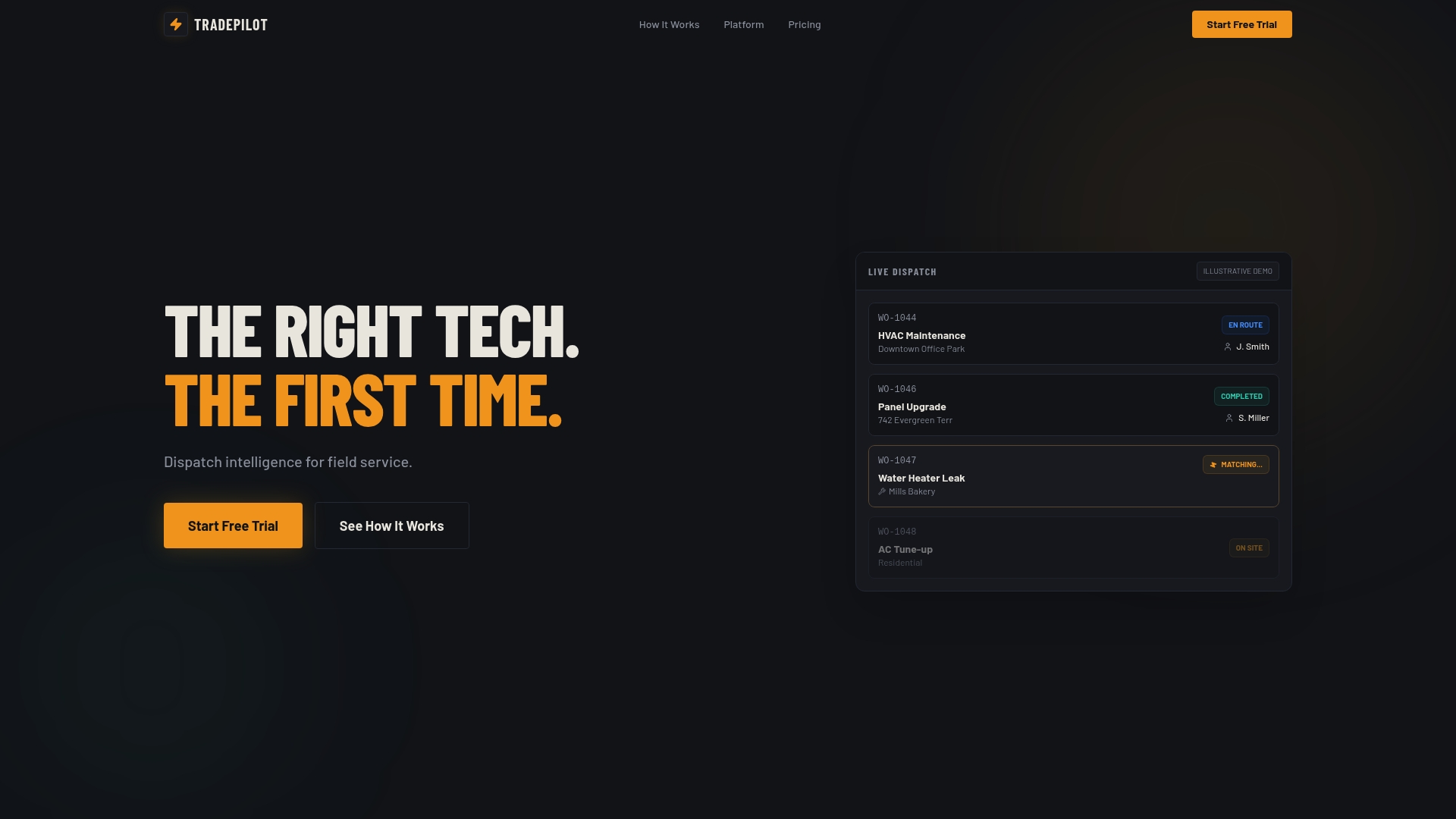
Start with a quick audit: pull your current time-to-assign and empty-mile numbers for the last 30 days, then compare them against what a live matching engine could do with the same job volume. If the gap looks worth closing, book a demo with TradePilot and walk through your own dispatch data on the call rather than a generic sales deck.
Sources
Dispatch analytics are only as good as the systems feeding them. Six sources matter most:
- Dispatch - Help - Analytics
- Logistics analytics: 5 types, KPIs, use cases & implementation guide (2026)
- Supply chain analytics (Coursera article)
Not every metric needs the same freshness. ETA and job status should stream in near real time; utilization and cost-per-job can batch overnight without hurting decision quality.
Pro Tip: Before connecting a new data source, confirm every system uses the same technician ID and timezone. Mismatched IDs and timezone drift are the two most common reasons dispatch dashboards quietly show wrong numbers for weeks before anyone notices.
Metadata gaps cause the second-biggest headache. A job record missing a service category or a technician missing a skill tag will throw off every downstream calculation, so audit completeness before you trust the dashboard.